Theme Switcher for Laravel Breeze
I had a long, very long, standing personal project (who doesn’t, hey?) that was in desperate need of attention. It was running on a old version of Laravel, it was using a very old-fashioned look-and-feel, a mix of Vue and Blade, some unit test, some Dusk, but not for everything. It was a bit of a mess, so I decided, like many other in my shoes, to start from scratch.
Obviously I am using Laravel, and because there will be same authentication and authorisation I chose to use Laravel Breeze. If you don’t know what it is, this is what the documentation says
Laravel Breeze is a minimal, simple implementation of all of Laravel’s authentication features, including login, registration, password reset, email verification, and password confirmation.
I follow the instruction on how to install it and chose the Blade scaffolding with Livewire and Class-based Volt. Most importantly I opted to support dark mode.
That simply meant that all the template and components have been styled for both light and dark mode, using Tailwind CSS.
What I did find puzzling was that there was no way to switch between themes. Sure, I could have added the dark class
to the <body>, but that isn’t what I was expecting. Since everything is already styled to support both themes, why
isn’t there a way for the user to change between light and dark mode?
This article is not about answering that question, that would be up to the Laravel Breeze’s maintainers. This article is about how I implemented a theme switcher that work with the scaffolded app.
Spoiler alert, it’s not all my original work.
I noticed that Laravel itself already comes with a theme switcher. If you get an error or an exception, Laravel displays something like the following:
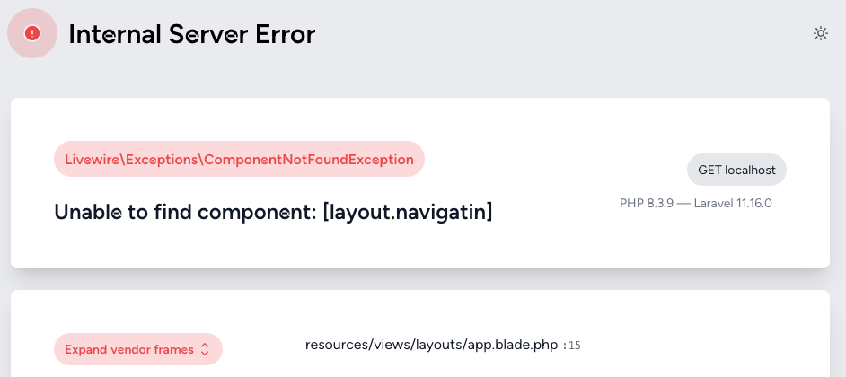
Did you notice the little sun icon (or moon icon if you’re using dark mode) on the top-right corner? That’s the Laravel’s theme switcher. That’s a good start, I can leverage it and adapt it to my case.
Although that was a good starting point, I didn’t feel it really worked well with the Breeze UI. I have to point out again that I chose the Blade and Livewire UI, so for Vue or React things may look different. What I did take from the Laravel theme switcher was the idea to store the user’s choice in the browser local storage.
This is how the theme switcher works:
- when the user chooses the dark theme, this choice is stored in the local storage and a class
darkis added to the whole document - when the user chooses the light theme, this choice is again stored in the local storage, but this time the
darkclass is removed from the document - when the user chooses the system settings, then the local storage is deleted and the
darkclass is added if the system theme is “dark” - finally, an event listener is set to watch out for changes in the system theme
Once that was done the rest was just a matter of UI. I chose to have a dropdown when the screen was big enough, or a series of three buttons for mobile screens.
Now, finally, let’s see some code. I have also created a GitHub Gist you can use.
resources/js/theme-switcher.js
export const ThemeSwitcher = {
  setDarkClass: () => {
    let isDark = localStorage.theme === 'dark' ||
      (!('theme' in localStorage) &&
        window.matchMedia('(prefers-color-scheme: dark)').matches)

    isDark
      ? document.documentElement.classList.add('dark')
      : document.documentElement.classList.remove('dark')
  },

  init: () => {
    ThemeSwitcher.setDarkClass()
    window.matchMedia('(prefers-color-scheme: dark)').addEventListener('change', ThemeSwitcher.setDarkClass)
    window.ThemeSwitcher = ThemeSwitcher
  }
}
resources/js/app.js
import './bootstrap';
import {ThemeSwitcher} from './theme-switcher';

ThemeSwitcher.init()
The next changes are in resources/views/livewire/layout/navigation.blade.php but it would be too awkward to paste the
whole file so I am going to show what to change. The whole file can be download
here.
First of all you need to set some initial state, so add the following to the x-data attribute of the nav element,
theme: localStorage.theme,
darkMode() {
    this.theme = 'dark'
    localStorage.theme = 'dark'
    ThemeSwitcher.setDarkClass()
},
lightMode() {
    this.theme = 'light'
    localStorage.theme = 'light'
    ThemeSwitcher.setDarkClass()
},
systemMode() {
    this.theme = undefined
    localStorage.removeItem('theme')
    ThemeSwitcher.setDarkClass()
},
Then we need to add the switcher on the page itself. I have decided to put it next to the profile, i.e. the user’s
email. So, add the following in the “Settings dropdown” section, just inside the outer div:
<div class="hidden sm:block">
    <x-dropdown width="w-28 mt-4">
        <x-slot name="trigger">
            <x-heroicon-s-sun class="w-5 h-5 block text-gray-500 hover:text-gray-700 dark:hidden"/>
            <x-heroicon-s-moon class="w-5 h-5 hidden dark:block dark:text-gray-400 dark:hover:text-gray-300"/>
        </x-slot>
        <x-slot name="content">
            <button class="flex w-full items-center gap-3 px-3 py-2 text-start text-sm leading-5 hover:bg-gray-100 dark:hover:bg-gray-800 focus:outline-none focus:bg-gray-100 dark:focus:bg-gray-800 transition duration-150 ease-in-out"
                    :class="theme === 'light' ? 'text-gray-900 font-medium' : 'text-gray-700 font-normal dark:text-gray-400 dark:font-normal'"
                    @click="lightMode()"
            >
                <x-heroicon-o-sun class="w-5 h-5" ::class="theme === 'light' ? 'hidden' : 'block'"/>
                <x-heroicon-s-sun class="w-5 h-5" ::class="theme === 'light' ? 'block' : 'hidden'"/>

            </button>
            <button class="flex w-full items-center gap-3 px-3 py-2 text-start text-sm leading-5 hover:bg-gray-100 dark:hover:bg-gray-800 focus:outline-none focus:bg-gray-100 dark:focus:bg-gray-800 transition duration-150 ease-in-out"
                    :class="theme === 'dark' ? 'dark:text-gray-100 dark:font-medium' : 'text-gray-700 font-normal dark:text-gray-400 dark:font-normal'"
                    @click="darkMode()"
            >
                <x-heroicon-o-moon class="w-5 h-5" ::class="theme === 'dark' ? 'hidden' : 'block'"/>
                <x-heroicon-s-moon class="w-5 h-5" ::class="theme === 'dark' ? 'block' : 'hidden'"/>

            </button>
            <button class="flex w-full items-center gap-3 px-3 py-2 text-start text-sm leading-5 hover:bg-gray-100 dark:hover:bg-gray-800 focus:outline-none focus:bg-gray-100 dark:focus:bg-gray-800 transition duration-150 ease-in-out"
                    :class="theme === undefined ? 'text-gray-900 font-medium dark:text-gray-100 dark:font-medium' : 'text-gray-700 font-normal dark:text-gray-400 dark:font-normal'"
                    @click="systemMode()"
            >
                <x-heroicon-o-computer-desktop class="w-5 h-5" ::class="theme === undefined ? 'hidden' : 'block'"/>
                <x-heroicon-s-computer-desktop class="w-5 h-5" ::class="theme === undefined  ? 'block' : 'hidden'"/>

            </button>
        </x-slot>
    </x-dropdown>
</div>
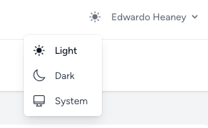
This is what the switcher will look like:
Finally, let’s add the switcher on small screens too. So in the Responsive Navigation Menu section but just before the Responsive Settings Options section, add the following:
<div class="py-3 px-4 border-t border-gray-200 dark:border-gray-600 grid grid-cols-3 gap-3 sm:hidden">
    <x-secondary-button @click="lightMode()" class="justify-center" ::class="theme === 'light' ? 'border-gray-400' : ''">
        <x-heroicon-o-sun class="w-5 h-5 mr-2" ::class="theme === 'light' ? 'hidden' : 'block'"/>
        <x-heroicon-s-sun class="w-5 h-5 mr-2" ::class="theme === 'light' ? 'block' : 'hidden'"/>

    </x-secondary-button>
    <x-secondary-button @click="darkMode()" class="justify-center" ::class="theme === 'dark' ? 'dark:border-white' : ''">
        <x-heroicon-o-moon class="w-5 h-5 mr-2" ::class="theme === 'dark' ? 'hidden' : 'block'"/>
        <x-heroicon-s-moon class="w-5 h-5 mr-2" ::class="theme === 'dark' ? 'block' : 'hidden'"/>

    </x-secondary-button>
    <x-secondary-button @click="systemMode()" class="justify-center" ::class="theme === undefined ? 'border-gray-400 dark:border-white' : ''">
        <x-heroicon-o-computer-desktop class="w-5 h-5 mr-2" ::class="theme === undefined ? 'hidden' : 'block'"/>
        <x-heroicon-s-computer-desktop class="w-5 h-5 mr-2" ::class="theme === undefined ? 'block' : 'hidden'"/>

    </x-secondary-button>
</div>
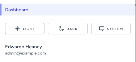
And this is what it will look like:


Leave a Comment
Your email address will not be published. Required fields are marked *